Introduction:
There has been so much positive response to my Will Worthington and The Black Rainbow cover that I decided to write all about the origins for this next entry. Now, previously, I hadn’t taken any credit for anything. I had been saying it was my cover designer. It was all my cover designer, but after talking to Dad, he did point out that it wasn’t just her incredible talent and expertise. In this entry, I’m going to explain what happened during the whole process, and how long it took.
As a few people know, I had been creating AI images to get ideas. As it turned out, I was doing that for about a month, and it did help. Even though I don’t support AI for final book covers, I have to admit that this period did prove to be very useful. During this time, I was thinking about colour, background, Will’s expressions and how the pineapples would be on the front. There was a particularly turbulent moment when I thought I’d never find anyone, and then, as luck would have it…. I connected with an illustrator who had followed my journey on Facebook for about two years, who recommended Katie Birks. She would also oversee things in the background, which was very useful and so kind.
Collaboration:
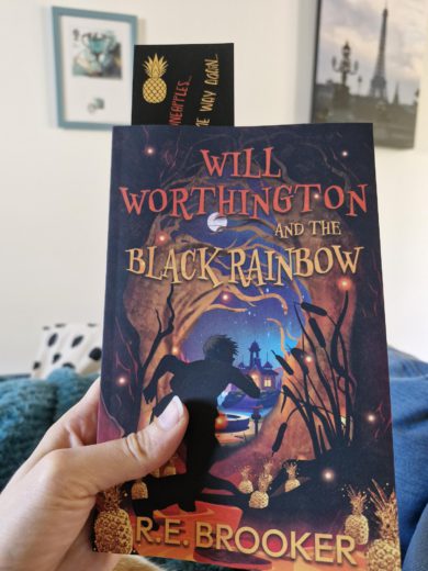
The first stage was arranging a video chat with Katie. It was really useful, and I stressed to her (more than anything) that it needed to look traditionally published. After all, I had been working on this book for nearly seventeen years. Will deserved to have a professional, artistic, and stylised cover; one that would sit alongside other upper middle grades. I had decided also that I wanted it to be the following: –
- Eye catching
- Action/adventure
- Silhouette of Will
- Bright colours
- Darkness
- Quirkiness
At this point, I had been looking at the ‘Itch’ series by Simon Mayo, which was a perfect example of the action silhouette figure I needed and wanted on the cover. From here, it was a back and forth collaboration of emails. I filled in a huge form with everything about my main characters. I attached images I found especially inspiring, and wrote descriptions about them. I wrote about the importance of having The Black Rainbow on the front, and what the invention is made from….. This was the point where Katie would send me the mock up ideas. At first, I wasn’t sure, and then as the illustrations continued, I realised that everything was coming together.
A week or so later, I received the next to final cover…. It was fabulous. Everything was there. The colours, the mood, the atmosphere of the book, but there was something missing. Quickly, I composed a message to Katie saying “It’s almost ready. I just think there should be a bit of depth to the picture, maybe more details? I was thinking maybe a moon, the hotel, a fountain, stars in the background?” I had an extra round of revisions, but it was worth it, because that’s what produced the cover it is now. As it transpired, Katie took my ideas and added them all! It was only when I saw the last mock up that I realised those extra bits were the icing on the cake!
I must also mention my friends and family. They suggested some things, like, “I think the text should be bigger here?” and “Have you thought about a font with character?” It really was a group effort. The day I lay the book down next to other upper middle grades and took a photo was the day I was certain the hard work and research had been worth it.
I am so honoured to have worked with Katie Birks. She was able to bring out everything I wanted. I told her my thoughts and she would give me drafts, and we would work through them. It was a perfect collaboration, and yes, even though Katie Birks was exceptional, I must also pat myself on the back, too. Much like my title, I had spent the time gathering market research, and it paid off.
Bookmarks:
Further on, Dad and I worked on making some bookmarks and ordering them. They arrived yesterday, and there are 200. Already, people have taken a few. I’m keeping track… just about! The design is so glossy and professional looking. Very happy.